BREAKOUT!
Role: Motion Graphics Artist
Year: 2024
This was supposed to be a sequence to see how well I’d be able to execute a 3D character animation; Something I had never done before.
Admittedly, I have a tendency to overestimate myself. This was much more demanding than I thought.
It’s fair to say I underestimated what it would take to bring it to life.
My respect to all the experts who mastered just one of the many skill required to achieve the masterful movie that is Shrek.
I learned a ton during the process and am looking forward to repeating it and refining the steps on other projects.
Other than that I can’t say too much about this other than that it was meant to come into existence.
Design, Modeling, Rigging, Texturing, Animation, Compositing: Michael Mueller
Sound Design & Music: Odd Panda
Here’s a bit of process!
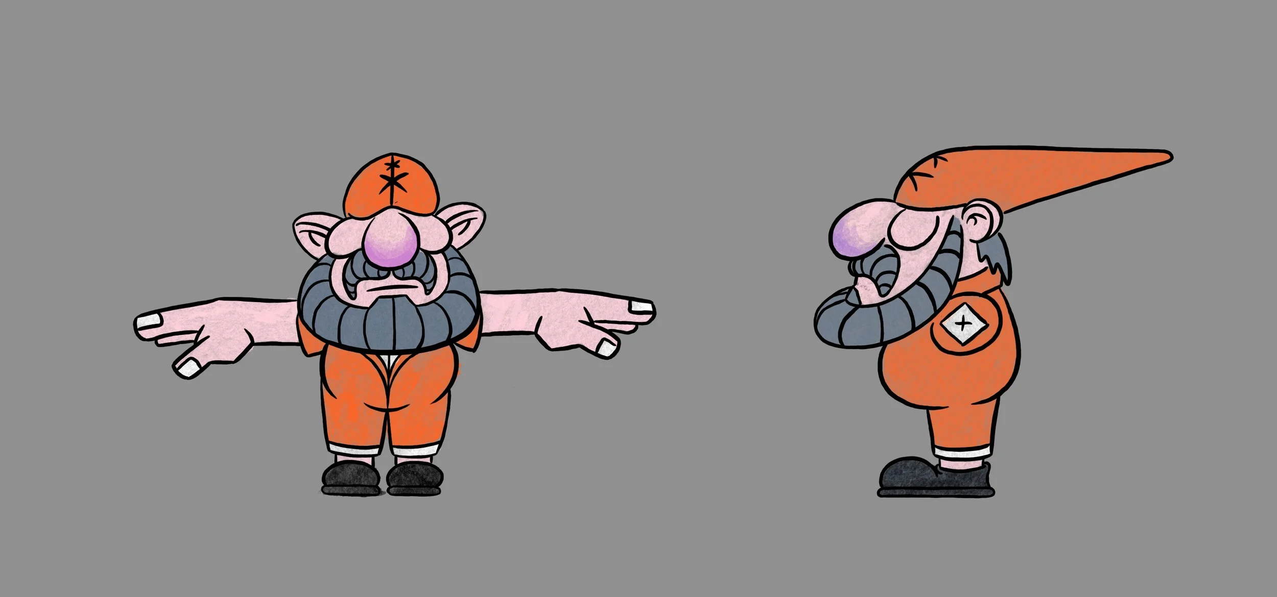
Sketching:
It all started with this shitty drawing lol.
Much better
YUM!
Started to roughly outline a concept.
Modelling:
Probably didn’t start out with the hand but it’s the oldest file I found:
Did I think I made a sick model at the time? Yes!
Would I do it the same way again? Hell no!
What I learned during the rest of the process is the value of having as few separate parts as possible. This model has just about everything separated. While this makes it easy to keep topology clean and is sometimes pretty difficult to avoid, it can create some hurdles when it comes to rigging and a bunch of issues when it comes to shading.
Rigging:
Piece of cake.
JOKE! Even-though I was familiar with the process of rigging from 2D, this was a whole other dimension of complexity.
I ended up taking a 40hr rigging class in frenglish (kidding, I love you Grandmaster Pierrick Picaut <3)
I literally could NOT have done it without this course, the man’s such a gift to the community.
He released an updated rigging course by now, The Art of Effective Rigging 2. Can’t wait to take it myself.
Animation:
I believe this is a close to the finish line WIP.
Still, as the animation is the core of the entire piece, looking at it in retrospect, I wish I had spent more time refining it. However, since it was my very first ever 3D character animation, what can you expect?
All these fancy controls I previously made were a lot to keep track of. It's something I want more training with for sure.
In the end, I guess it could be worse.
Texturing:
Something I had a great deal of fun with. I just love node-based texturing. Could have gone crazier with imperfections but what gives.
I also learned about the importance of clean UVs and how to set them up in a way that is readable for humans (as optimizing them for computers will look much different.)
My first attempt wasn’t great but thanks to this amazing and extremely comprehensive 3h tutorial by Outgang, I was able to get a good understanding about the topic, clean them up fairly well, which gave me the exact look of my texture I was after.
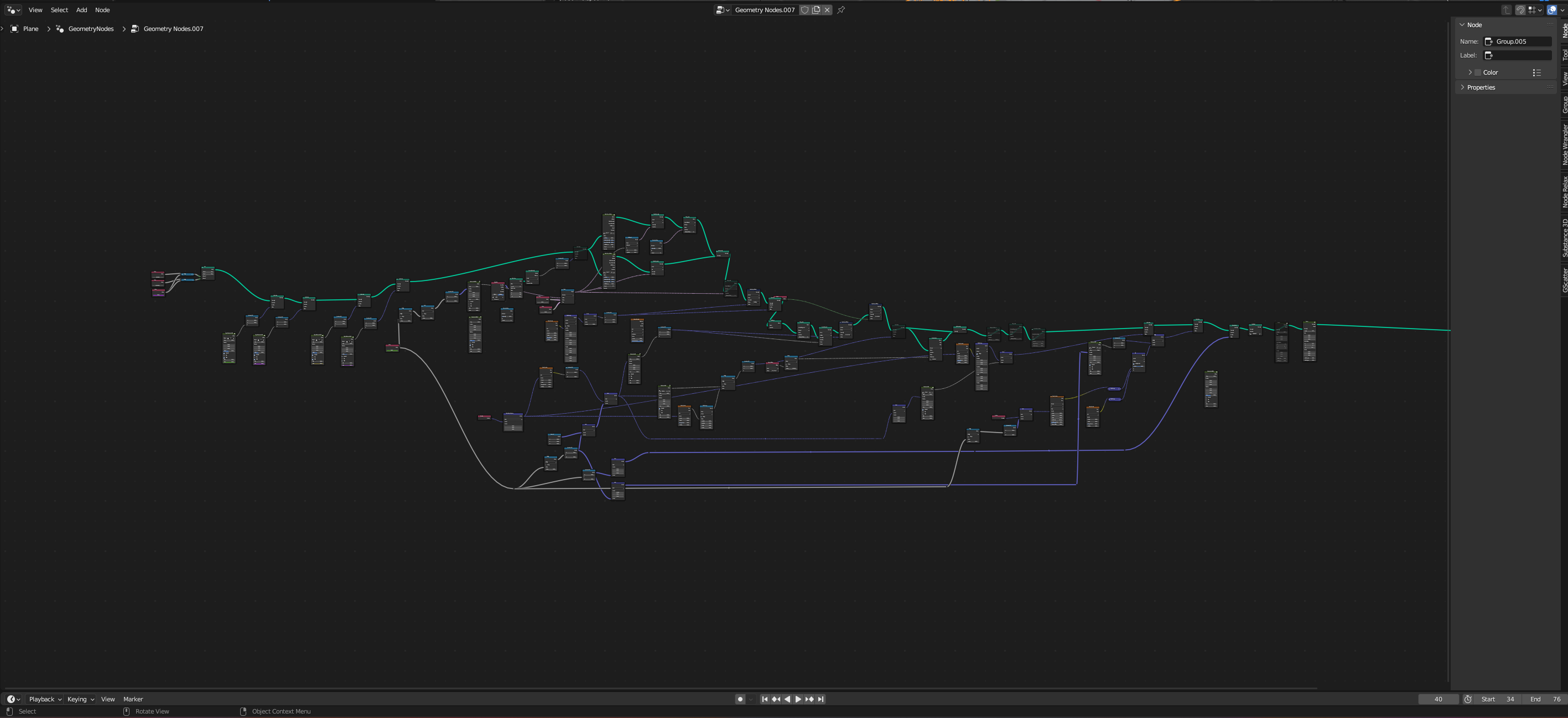
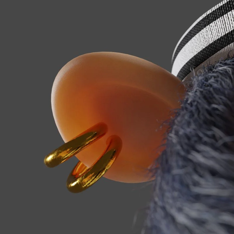
Blender has crazy good hair tools by now and getting the beard just right was one of my favorite parts.
The semi-realistic look was done in Cycles. The toon-look was done in EEVEE using the awesome Lightning Boy Shader.
This is where I had the most trouble with my separated character parts. It didn’t combine too well with how this particular shader works, giving me rim lights at unwanted spots which were difficult to hide.
Backdrop-Design & Compositing:
Love it or hate it but I used this hot, new AI stuff to patch together this spraypainted background wall. Probably could have scraped together some graffities online but since this is something I’ve been wanting to look into anyway I gave it a shot.
I feel like this was the perfect application. Most of the images it spits out look fine on first glance, but get weirder and reveal their nonsensical nature the longer you look at them.
So using them for a fast moving background feels like exactly the type of thing where you can get away with it.
I used a local model, which creates images blazingly fast. It definitely had a preference for blue and orange. To the point where it was almost impossible to get different colors so I had to recolored most of them afterwards.
As impressive as it was to work with it, 80% of what it gave me was unusable and I found it very artistically unfulfilling to roll the dice, wait for it and think about how robots are gonna take over the world soon in the meantime.

There’s something extremely satisfying about comping your own renders, it just feels so rewarding. It’s like putting the whip-cream, sprinkles and a big, juicy cherry on all the things you worked on for so long. Muah!
Overall, for my first 3D character project, I’m pretty happy with it.
Thanks for reading!
Have a wonderful day <3


